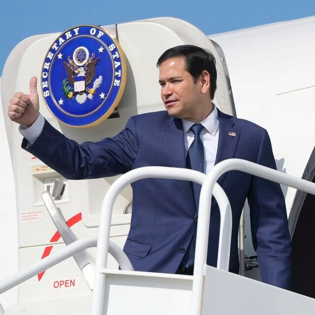
Secretary Marco Rubio aboard Air Force Three, 2025. Photo courtesy of the Embassy of the United States of America to Italy. Public domain.
You wouldn’t think a font could spark a political firestorm, but the U.S. State Department’s latest move has tongues wagging from Washington to embassies worldwide. Imagine being told your official government documents must change fonts in the name of “restoring decorum.” What sounds like a minor formatting tweak is actually the latest salvo in a fierce culture clash playing out behind closed doors. The question is: why is the choice between Calibri and Times New Roman stirring up so much controversy?
Rubio’s Return to Tradition
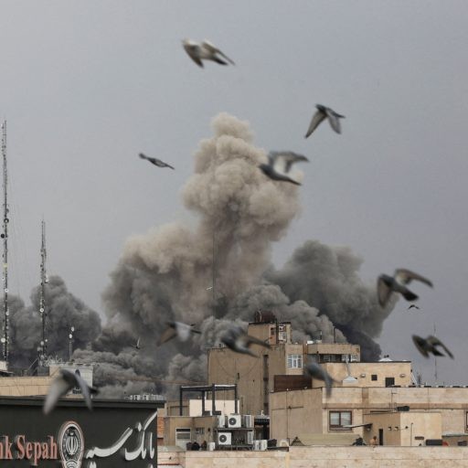
Earlier this month, Secretary of State Marco Rubio reportedly issued a memo ordering the State Department to abandon the sans-serif font Calibri for official documents and revert to Times New Roman 14-point font, as reported by PEOPLE. Rubio described the previous switch to Calibri, made in 2023 under former Secretary Antony Blinken, as a “wasteful” Diversity, Equity, Inclusion, and Accessibility (DEIA) program that degraded the department’s correspondence and clashed with the State Department’s letterhead, as reported by the Associated Press.
Rubio’s memo criticized the 2023 change as a misguided effort rooted in DEIA policies, which he has been systematically dismantling since taking office. The memo cited a $145,000 cost to the department for the switch but did not provide detailed evidence supporting this figure, as reported by the Associated Press.
The memo emphasized that serif fonts like Times New Roman are traditionally associated with formality and professionalism, noting their use by the White House, Supreme Court, and other government entities. Rubio framed the return to Times New Roman as a way to restore “decorum and professionalism” to the department’s written work products and align with President Donald Trump’s “One Voice for America’s Foreign Relations” directive, as cited in Rubio’s memo, PEOPLE reports.
Accessibility Rationale and Pushback
The original decision to adopt Calibri was made by Antony Blinken in 2023 to improve accessibility for readers with visual impairments. Calibri, a sans-serif font, is generally easier to read for people with certain disabilities and is better processed by screen readers and optical character recognition software. According to PEOPLE, a 2022 National Institutes of Health study supports the idea that sans-serif fonts like Calibri enhance readability for some users.
More Than a Font Fight
Though it may seem trivial, the font debate reflects deeper tensions over identity, inclusivity, and what constitutes professionalism in government communications. Rubio’s memo explicitly links the font change to a broader rollback of DEIA initiatives, which he and the Trump administration view as wasteful or harmful. Rubio has abolished offices and initiatives created to promote diversity and inclusion, both domestically and abroad, and ended foreign assistance funding for DEIA projects.
Critics question whether the choice of Calibri was truly a “woke” political statement or a practical step toward accessibility. Calibri was Microsoft Office’s default font until mid-2023, when it was reportedly replaced by Aptos, another sans-serif font designed for accessibility. The State Department’s adoption of Calibri was consistent with modern standards for readability and inclusivity.
Implementation Details and Exceptions
The State Department is now tasked with updating all official document templates to remove Calibri and reinstate Times New Roman, except for documents related to international treaties and presidential appointments, which require Courier New 12-point font, as reported by the Associated Press.
What This Means Going Forward
Rubio’s font reversal is part of a larger effort by the Trump administration to reshape federal agencies according to its vision. The emphasis on “merit-based standards” and the rejection of DEIA programs signal a shift away from policies aimed at broadening inclusivity.
For those who rely on accessible fonts, the return to Times New Roman may feel like a step backward. For others, it represents a return to a more formal, traditional style of government communication.
Whether this change will affect the clarity and inclusivity of State Department communications remains to be seen. What is clear is that even something as seemingly mundane as a font choice can become a battleground for competing visions of America’s identity and values.
The next time you open a government document, you might want to take a closer look at the font. It could tell you more about the politics behind the scenes than you expect.
References: Rubio calls this font too ‘woke’ for the State Department | Marco Rubio Removes State Department’s Official Typeface, Says It ‘Lacks Decorum’ | Marco Rubio Orders State Dept to Stop Using Calibri Font in Anti-DEI Push